Maps of Projected Change

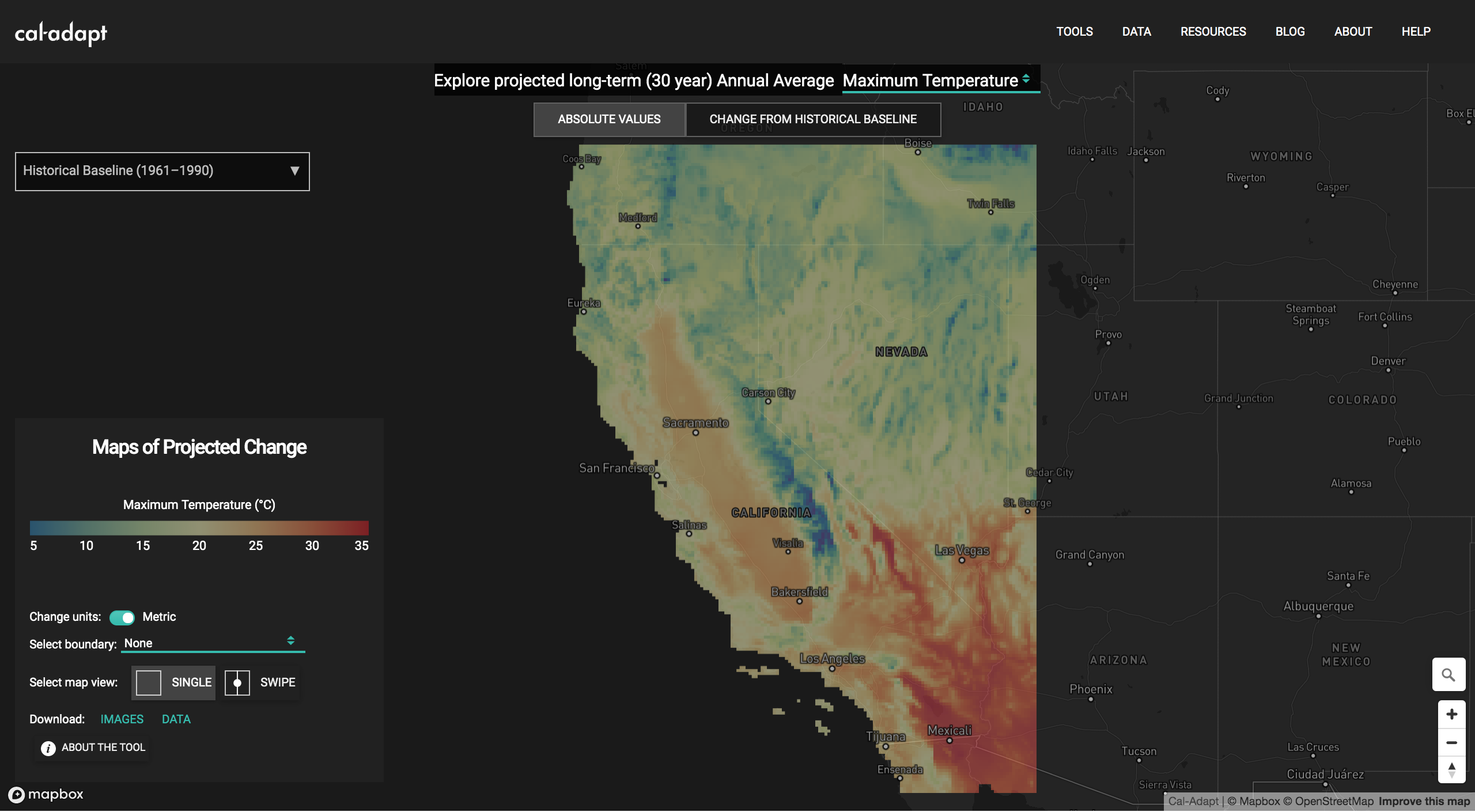
Cal-Adapt has released a new tool: Maps of Projected Change. The Maps of Projected Change tool allows you to compare long-term historic climate with projected future climate in a quick geographic display. Climate data visualized in the tool represent 30 year ensemble averages from 10 LOCA downscaled climate models for three climate variables - annual averages of maximum temperature, minimum temperature and precipitation.
Selecting overlays
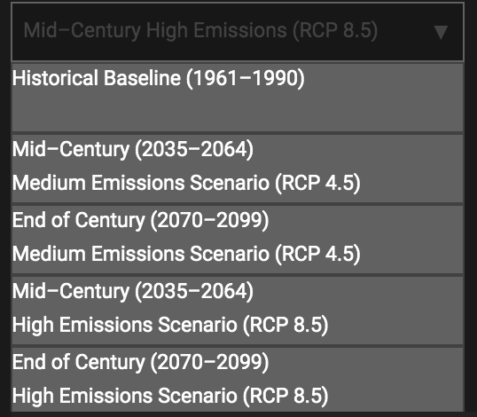
Because future climate projections express natural climate variability, analyzing a longer time period gives you a better sense of overall future conditions. The tools shows data as 30 year ensemble averages because 30 years is the traditional length of record used in climatological studies to characterize a regional climate. The time periods available in the tool are:
- Historic climate conditions (1961 to 1990)
- Mid–Century (2035 to 2064) centered on the year 2050
- End of Century (2070 to 2099).
Future climate projections for two emissions scenarios, also called Representative Concentration Pathways (RCPs) are included in the tool:
- RCP 8.5 is the high emissions scenario in which emissions continue to rise throughout the 21st century
- RCP 4.5 is the medium emissions scenario assumes that emissions peak in 2040 and then decrease for the rest of the century
Using the dropdown list, you can select a emissions scenario-time period combination of interest to you.

Different views
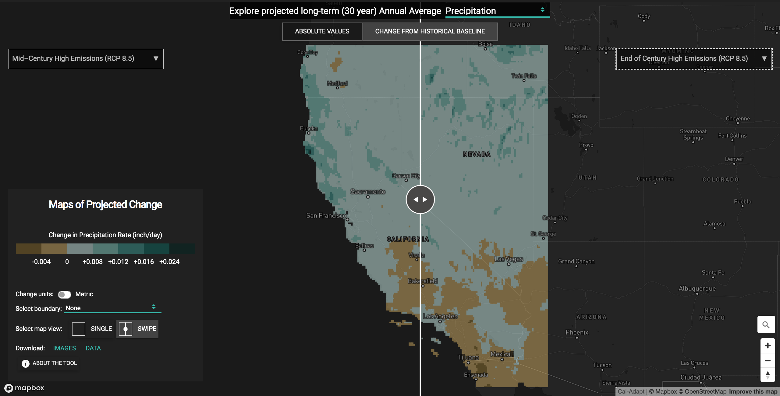
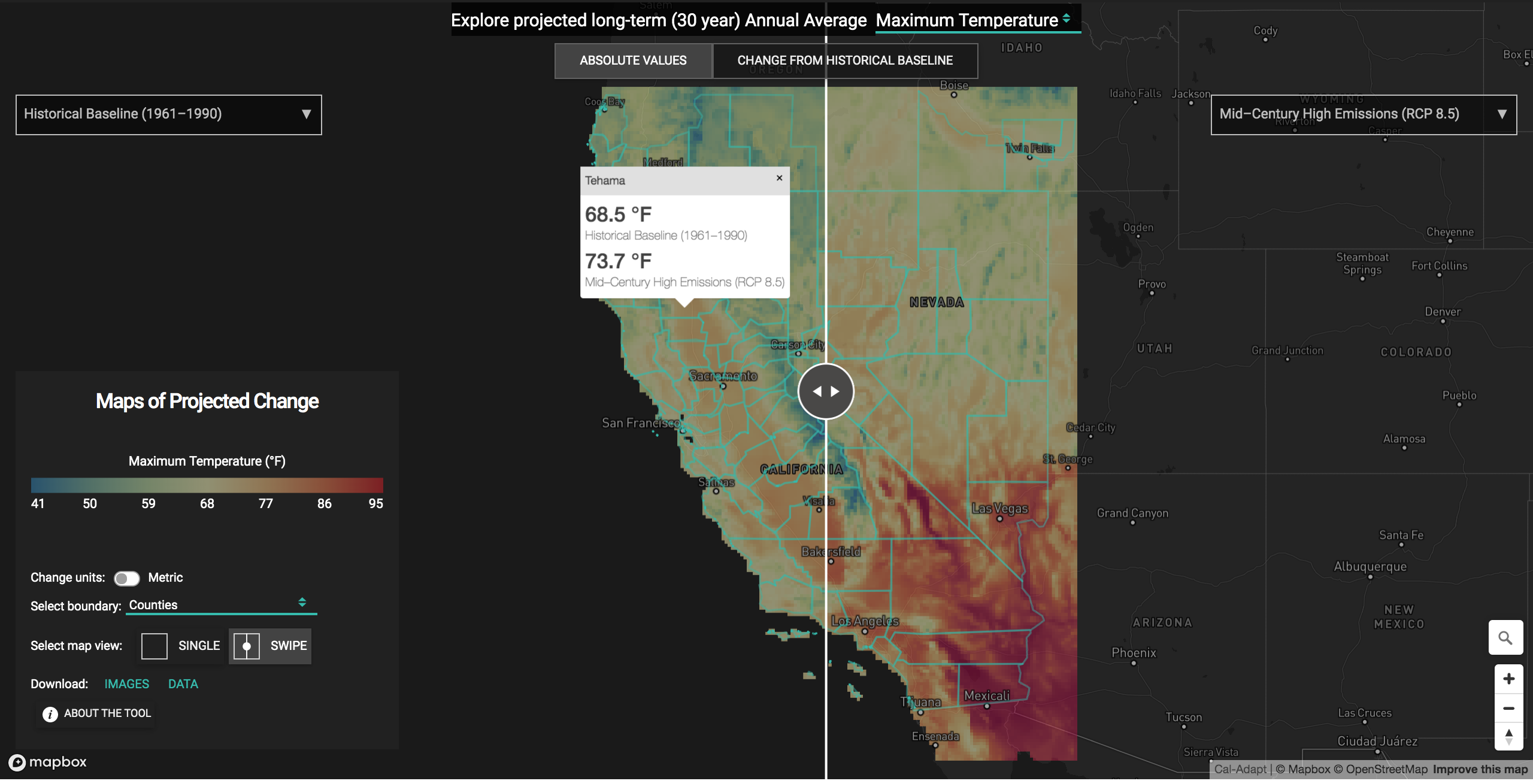
The Maps of Projected Change tool also lets you explore the data in multiple ways. You can view projected absolute values or projected changes in value from historical baseline . Users can also explore the data as a single map view (SINGLE) or create a layered map view (SWIPE) to view two different emissions scenario-time periods at the same time. The layered map view shows two maps layered over each other with a vertical bar that can be swiped back and forth to reveal different parts of the map below.

Click on the overlay to get a popup box with data value for the underlying grid cell. To get data aggregated overy a county, city or other boundary, select a boundary layer from the dropdown list first. This will display the boundary layer on top of the overlay. Click on a polygon to get a data value spatially aggregated over the polygon. You also have the option to switch units between the Metric and Imperial systems (e.g. °C/°F).

Download data
And if you find the maps useful, you can download the overlays as images (PNG) or as raster data (GeoTIFF) that you can import into a GIS program or other analytic environment.
Explore
We hope this tool makes it easier to understand how climate change may impact California’s temperatures and precipitation, compared to the state’s recent climate history. If you want to learn more about how to use climate projections, check out our guidance page. And if you have any questions, don’t hesitate to reach out to the Cal-Adapt support team at support@cal-adapt.org.
master